

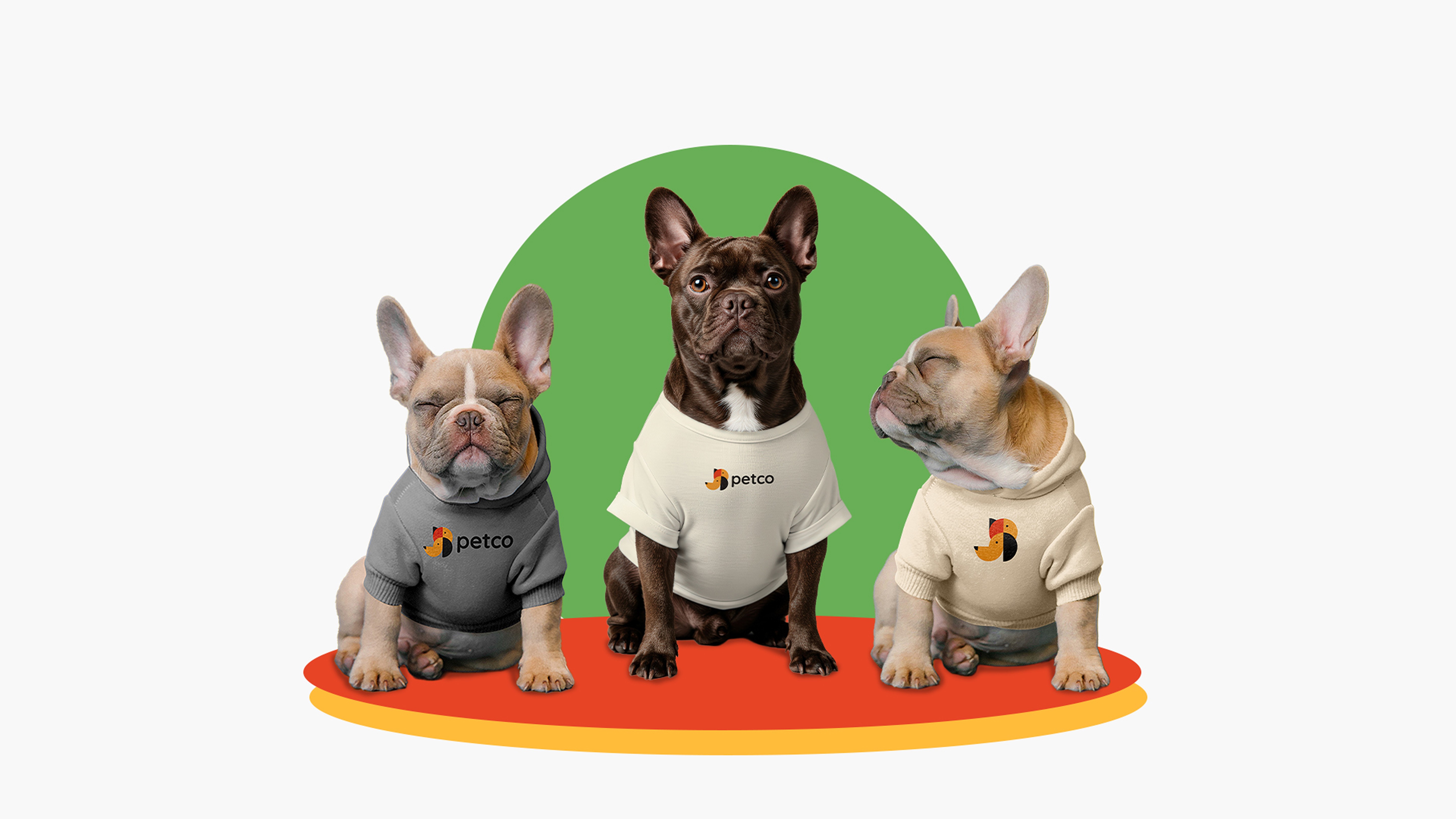
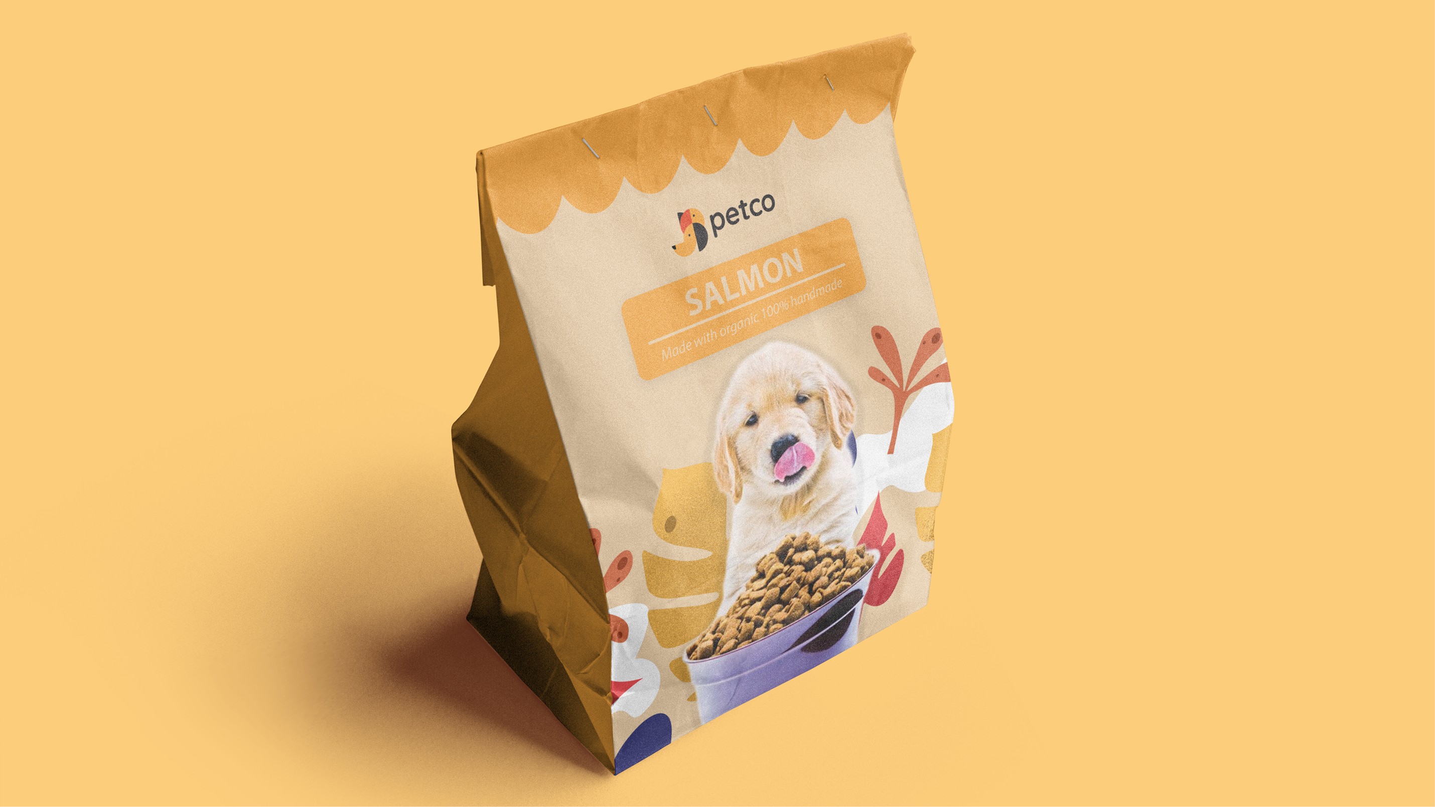
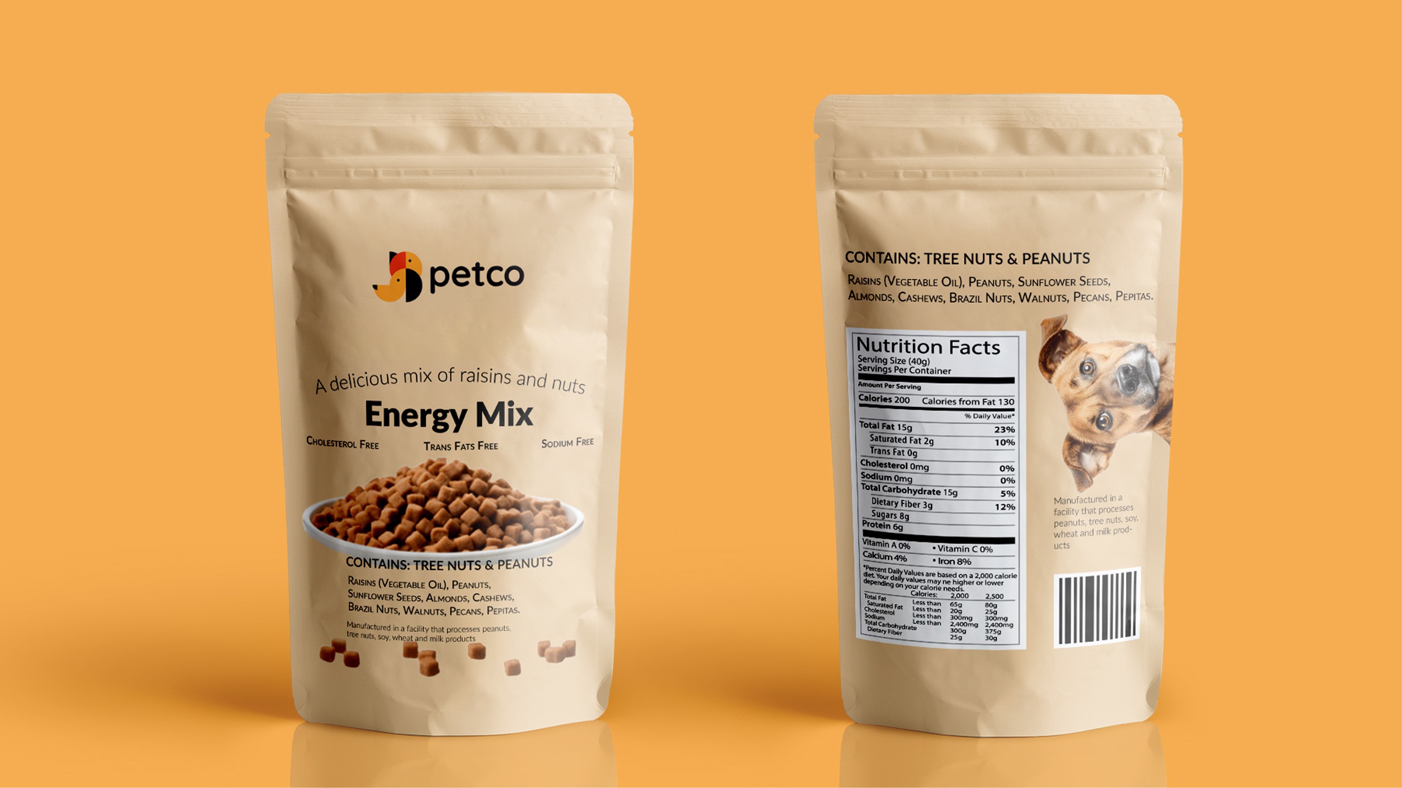
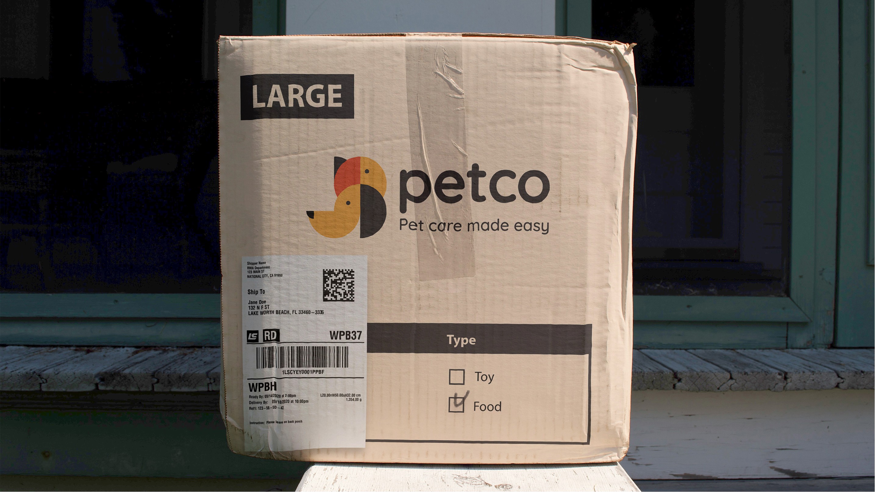
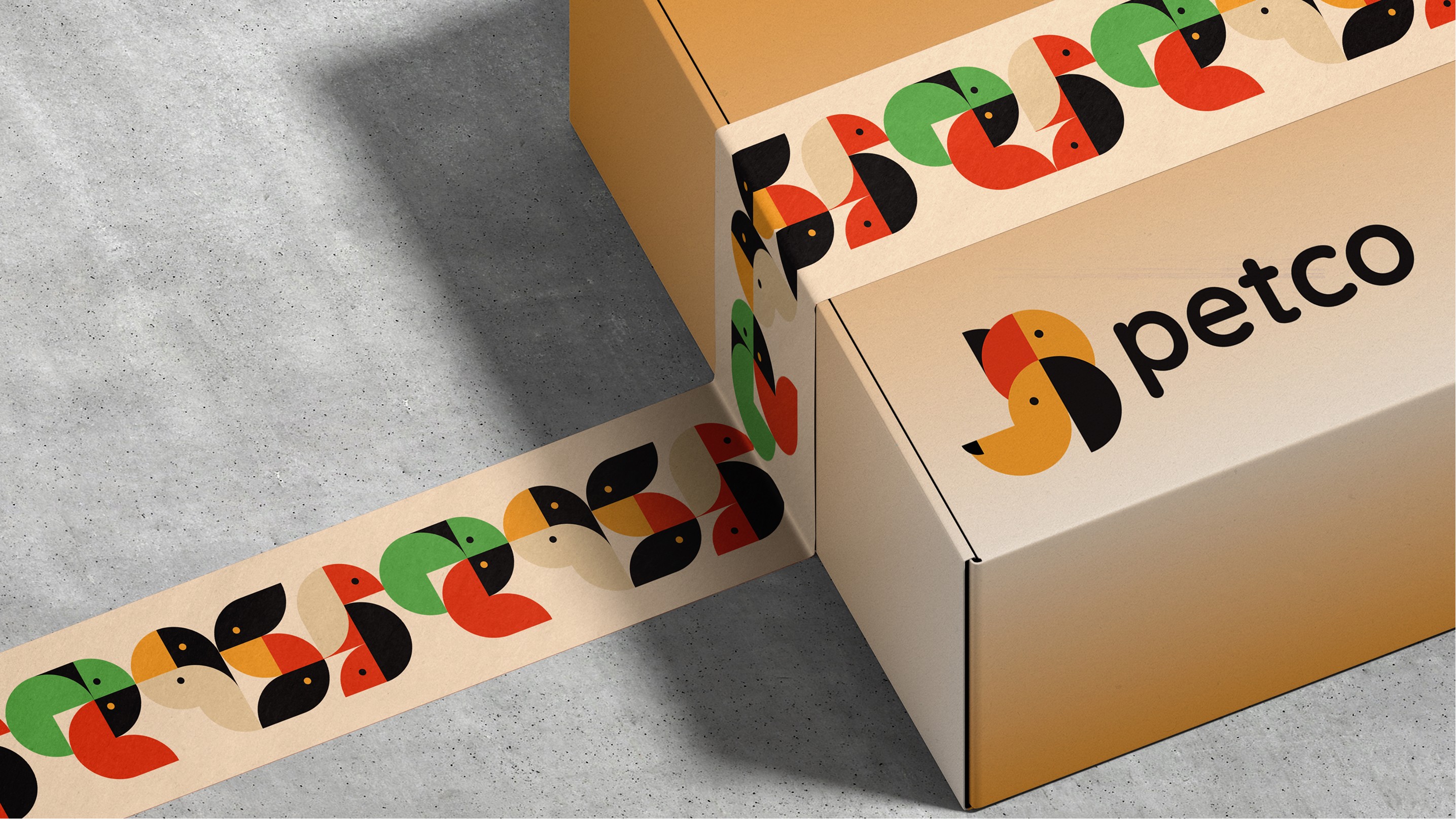
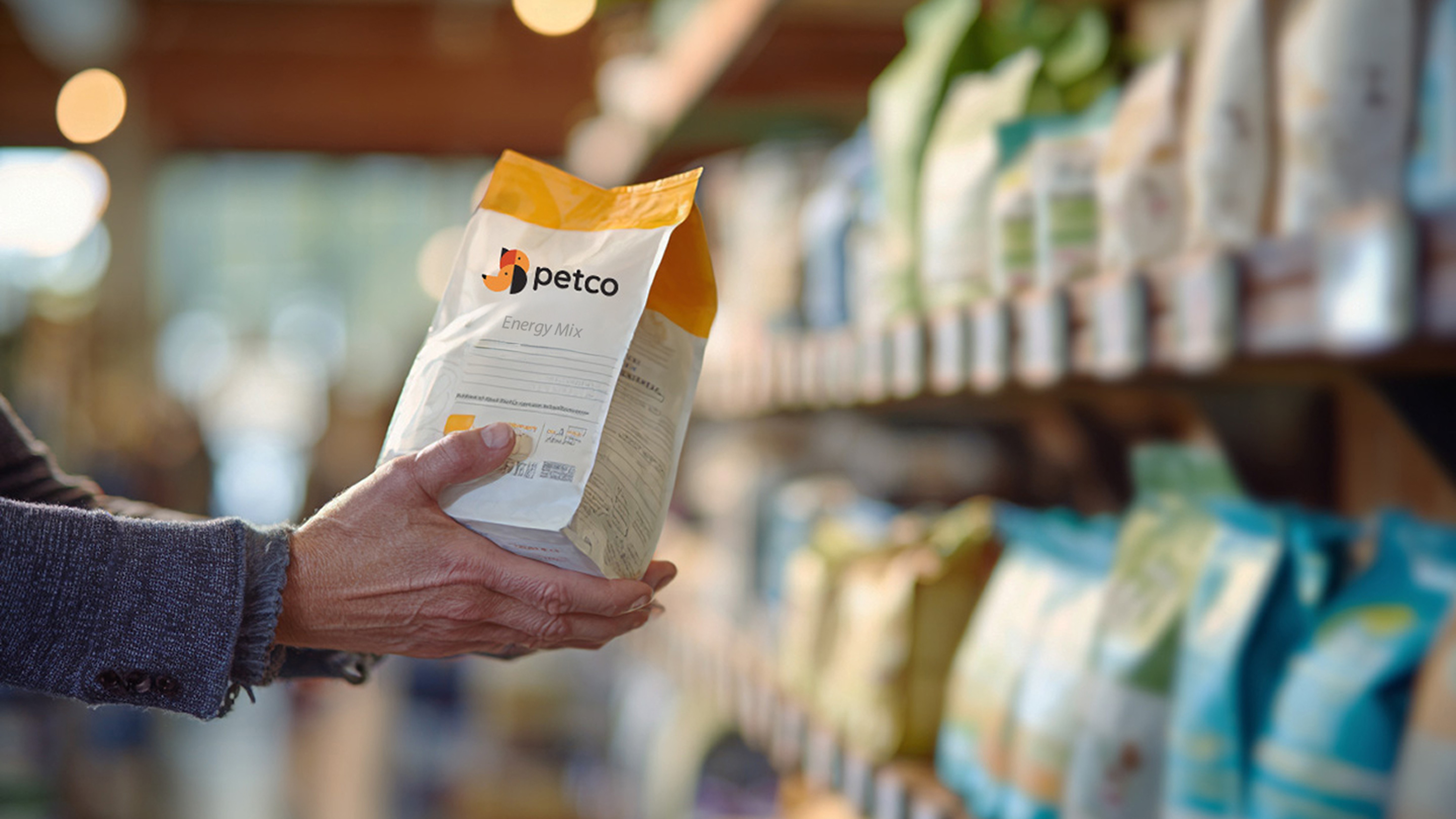
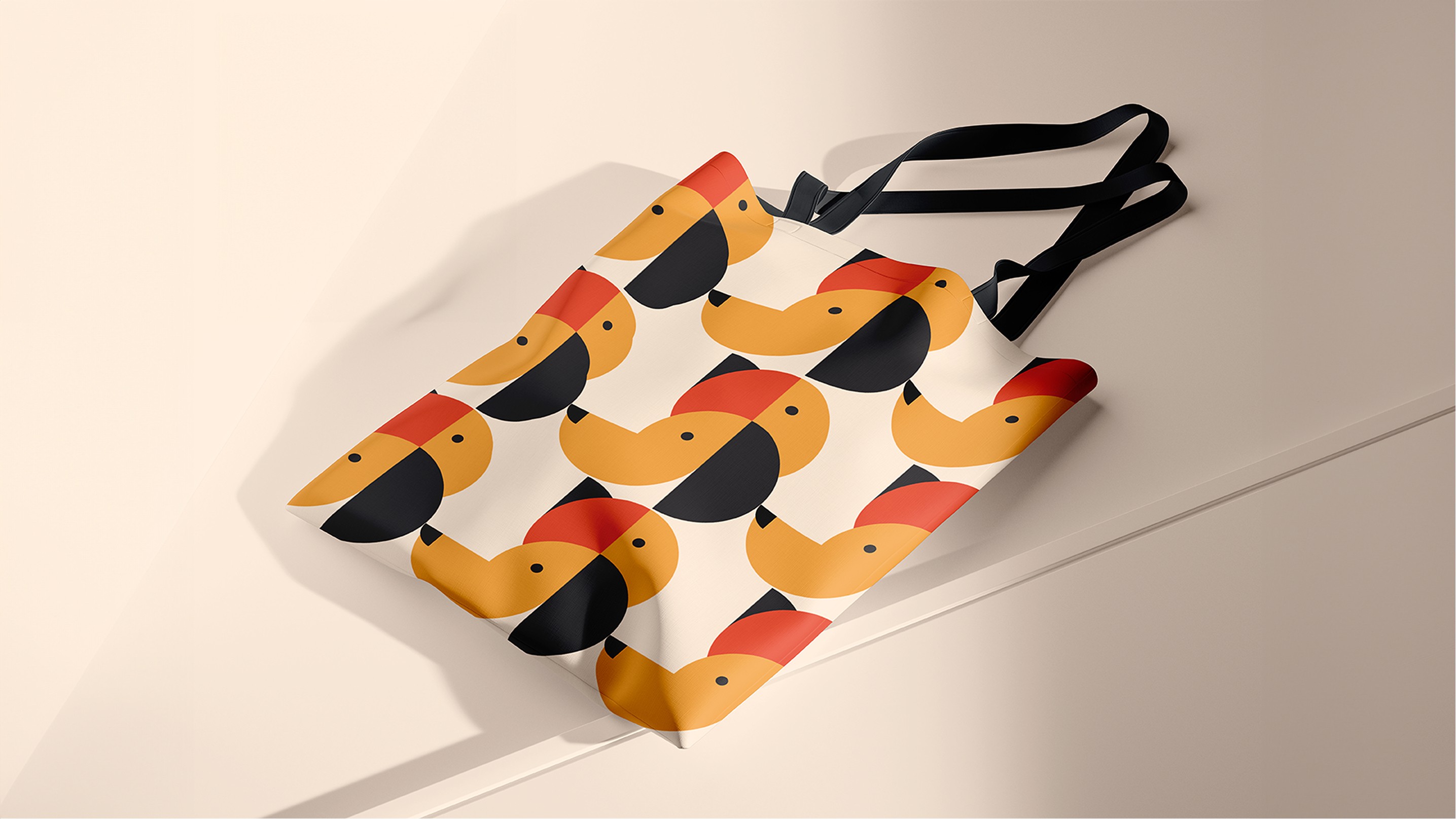
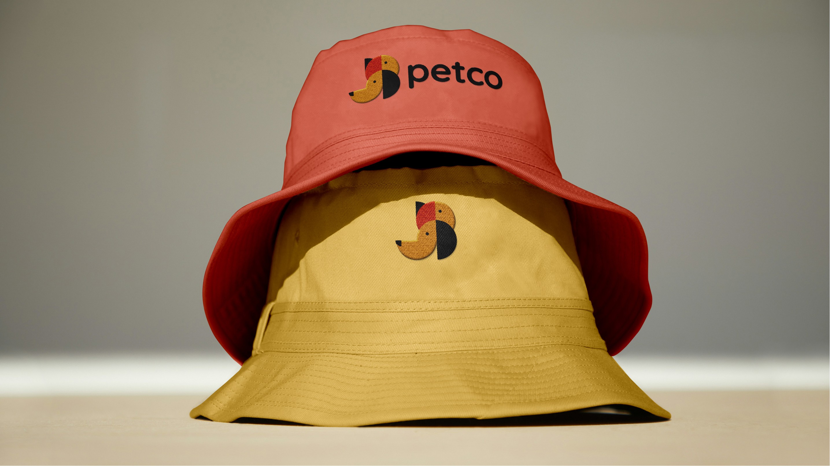
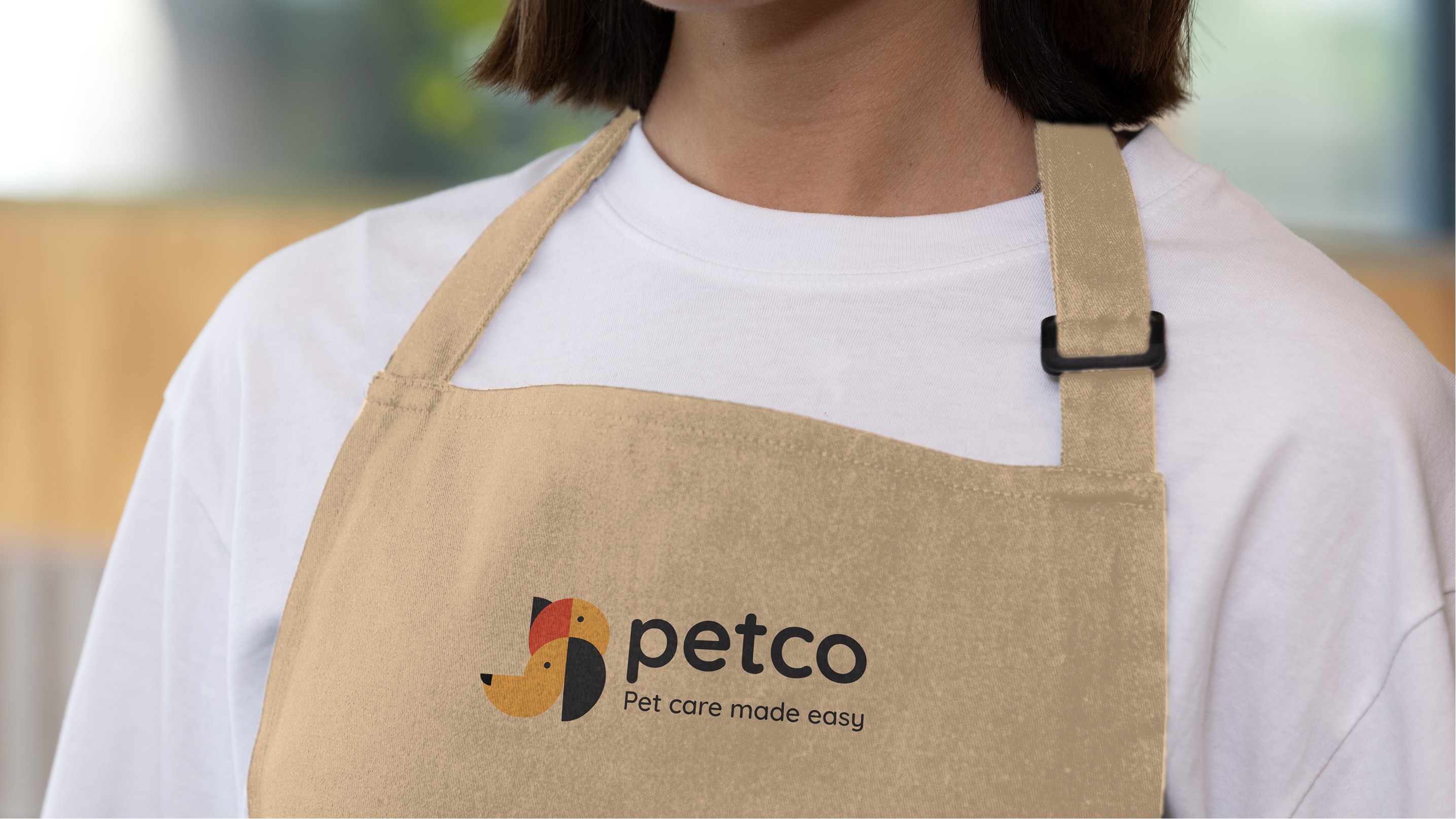
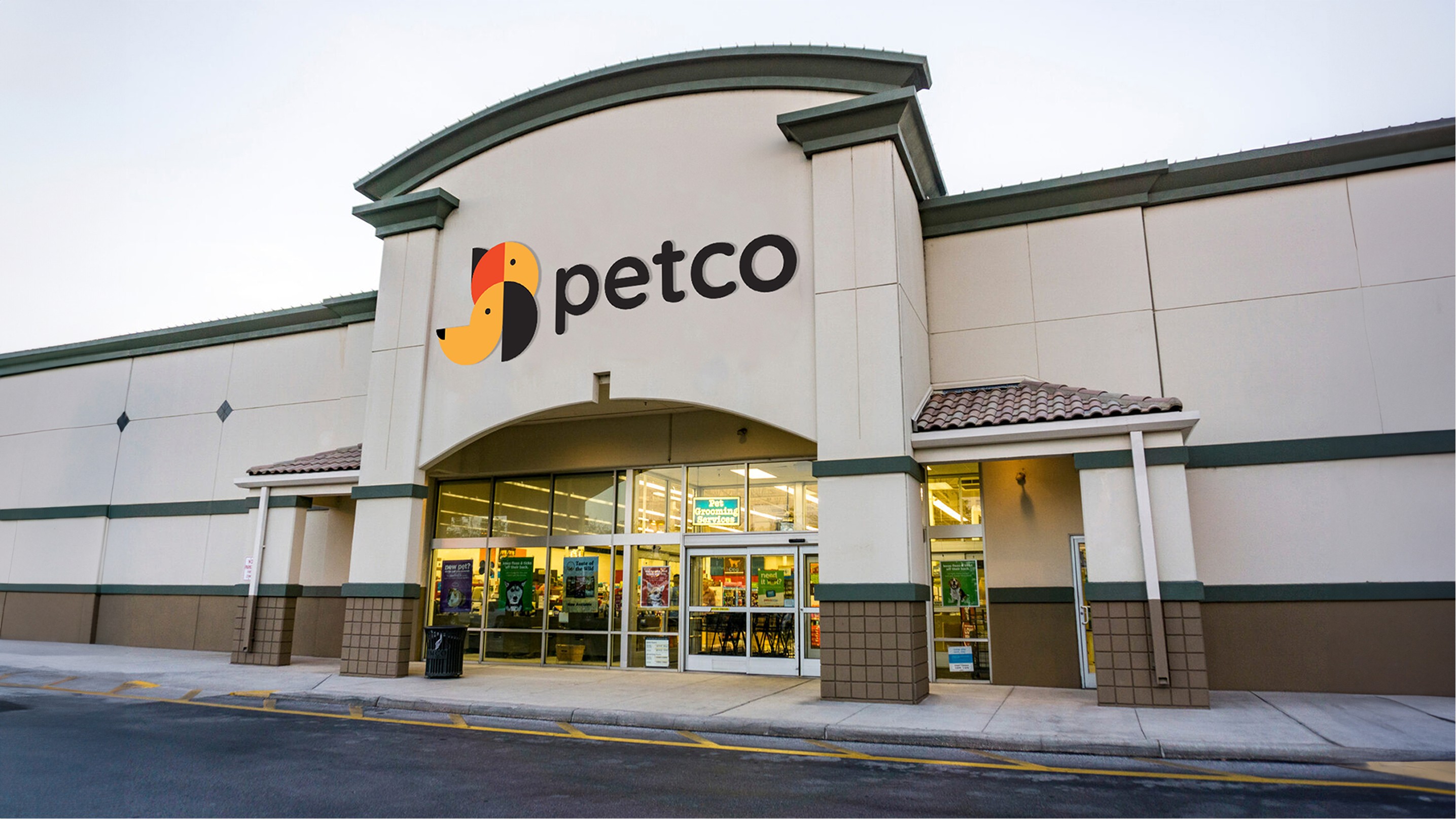
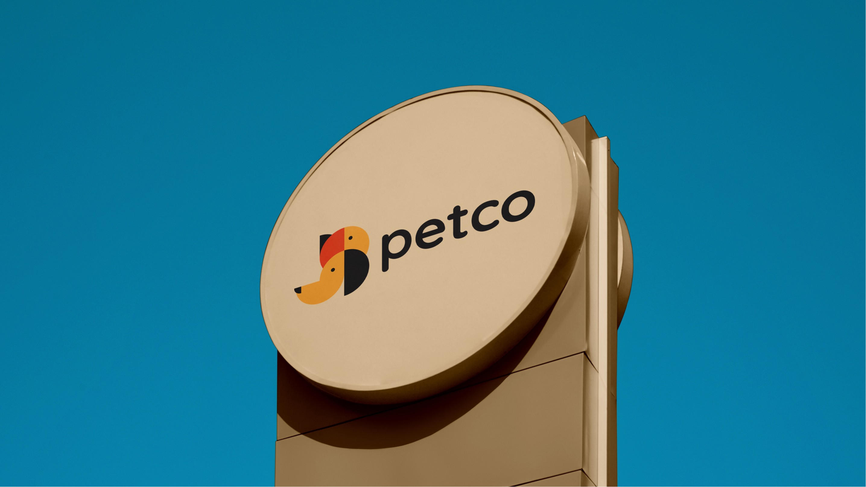
Master Brand Identity

Clear Space
Structure Analysis
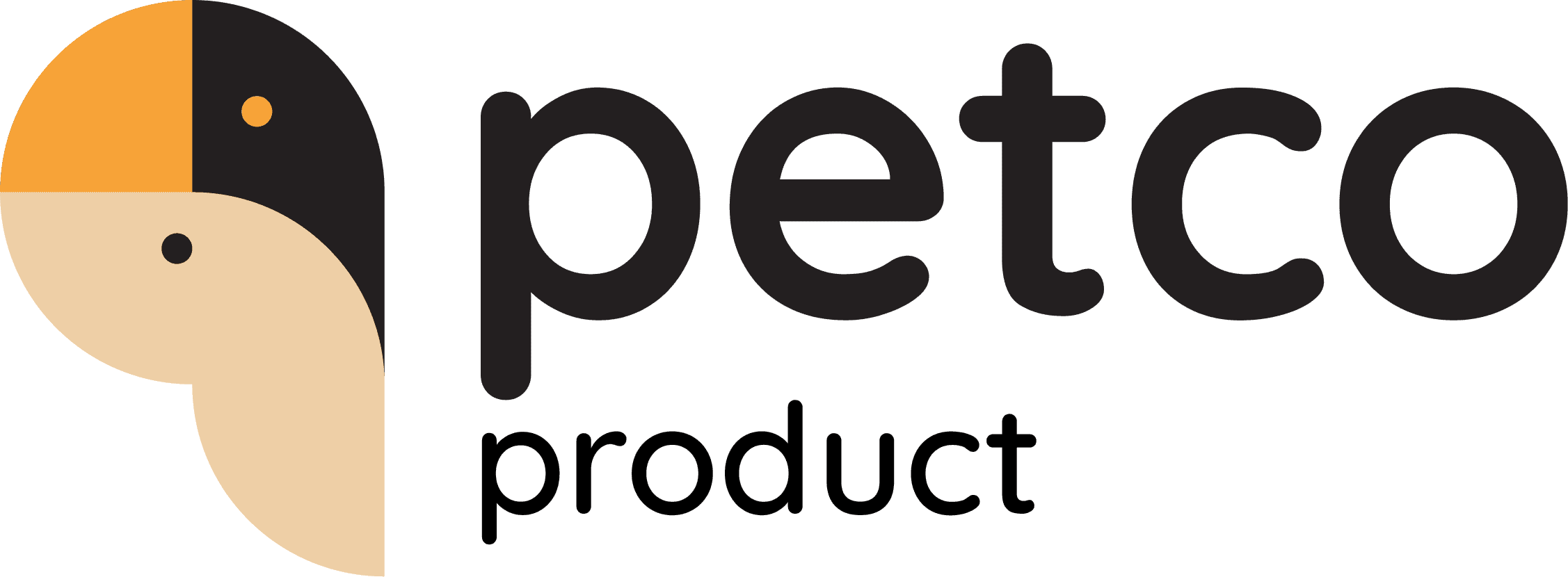
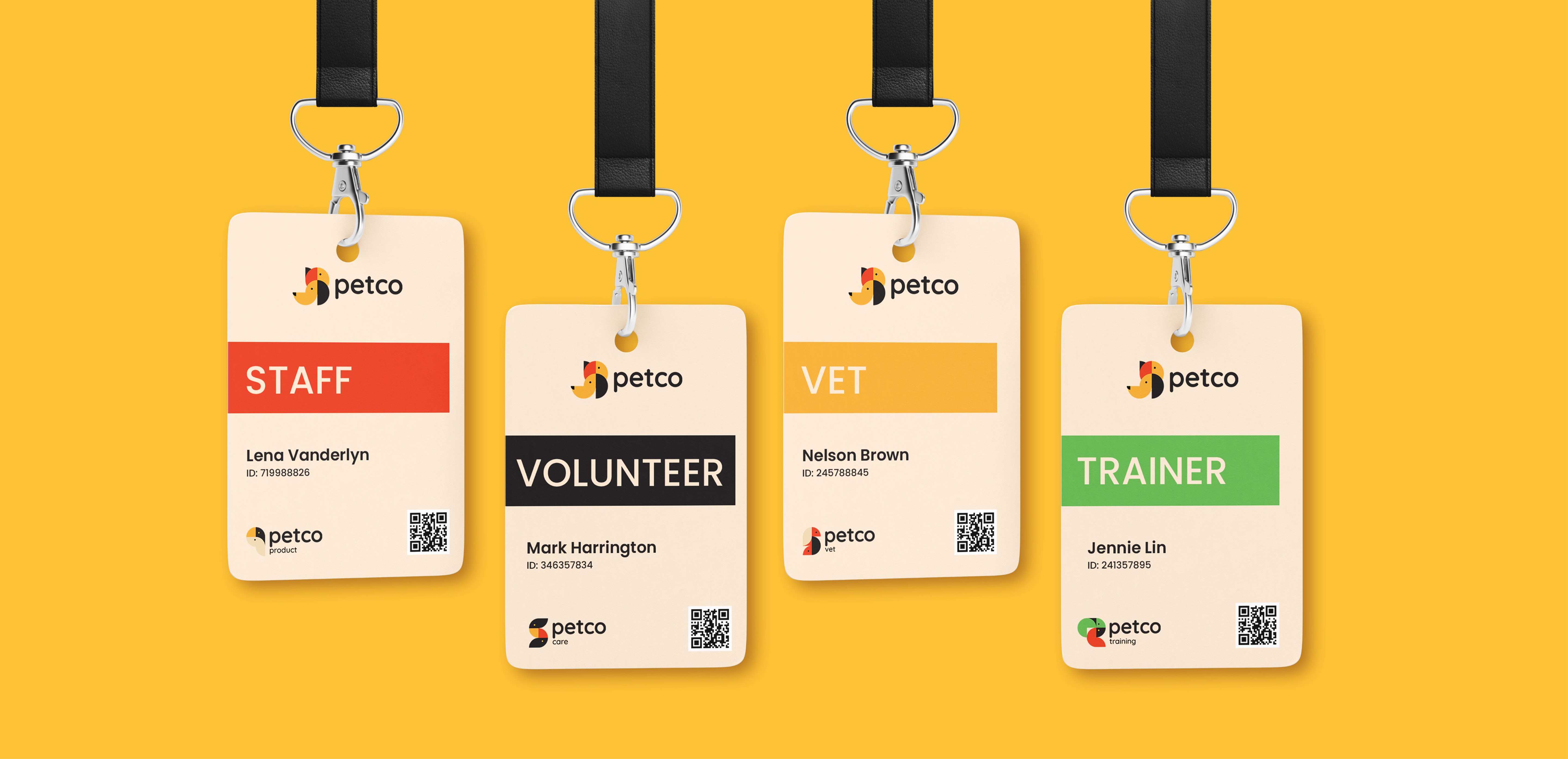
Product
Inspired by a pet’s head and ears, the Product logo suggests familiarity and daily interaction. Its structured yet rounded form reflects reliability, accessibility, and everyday use.
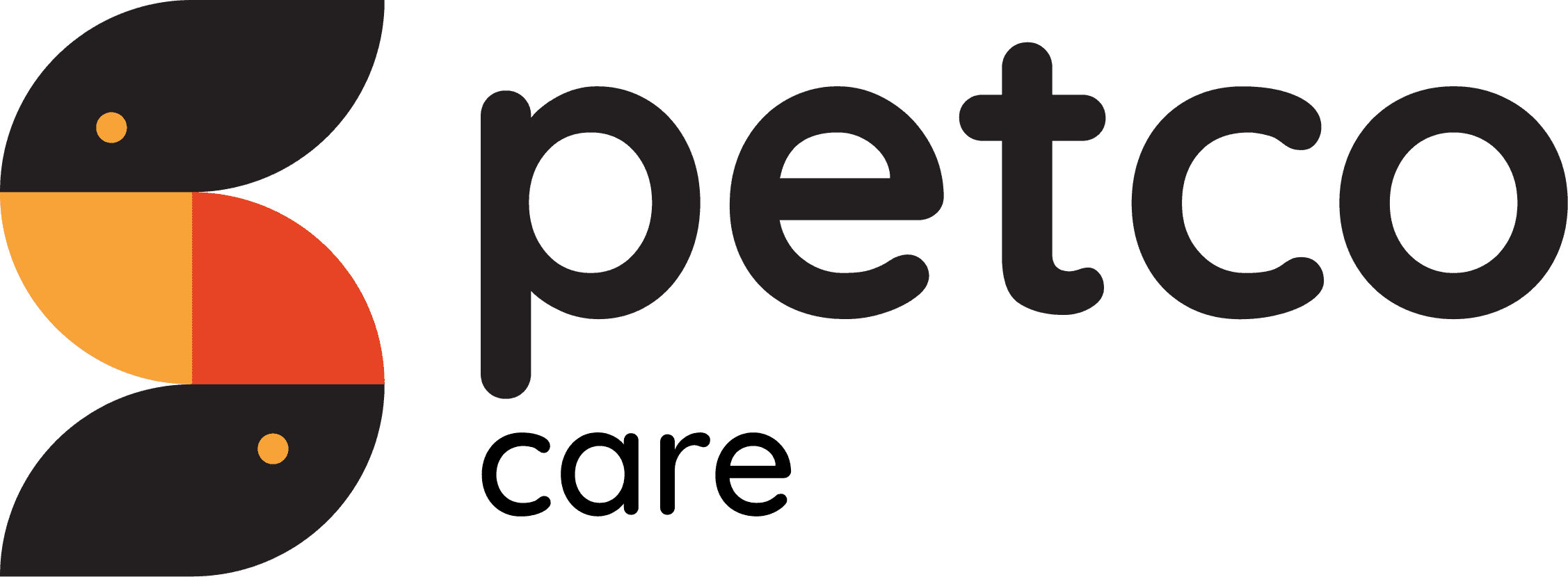
Care
The Care logo references a curled animal posture, symbolizing protection and comfort. Enclosing shapes convey warmth, trust, and emotional connection.

Training
The Training logo draws from animal movement and alert posture, such as raised ears. Interlocking forms represent communication, learning, and interaction.
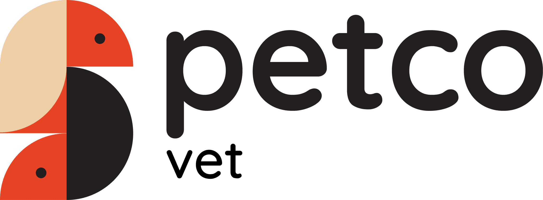
Vet
Based on strong animal body structures, the Vet logo conveys stability and professionalism. Balanced geometry ensures trust while remaining approachable.
Mark Structure Analysis
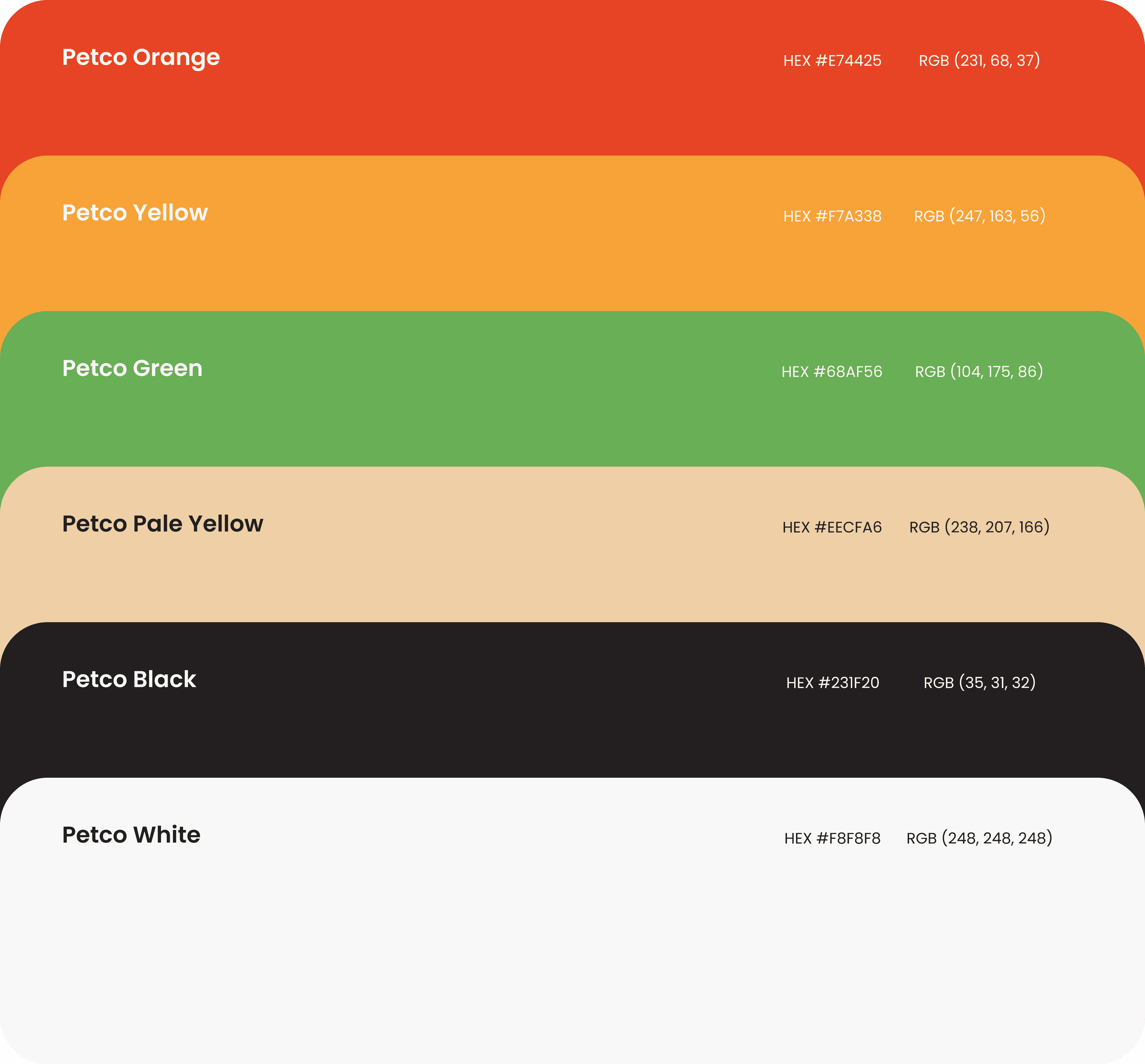
Brand Color Pallet
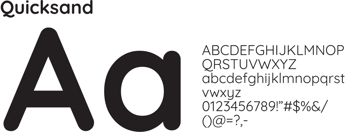
Brand Typeface
Social Media
Next Project